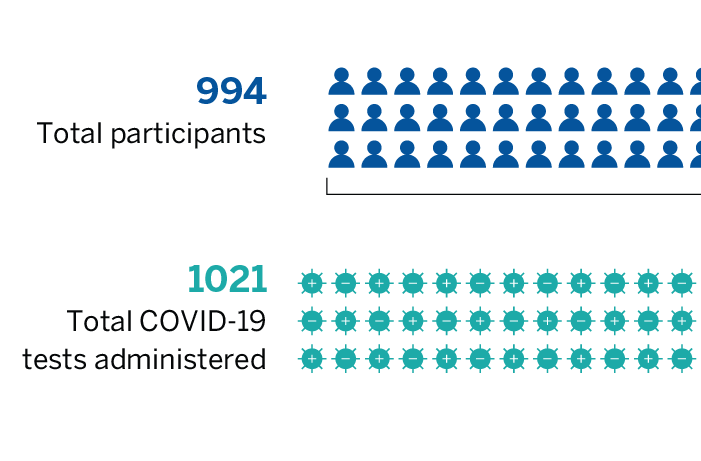
We designed this data visualization to provide an at-a-glance explanation of several key metrics for a grant program focused on COVID-19 testing and vaccination.
Client Project Tag Archives:
Global Carbon Footprint
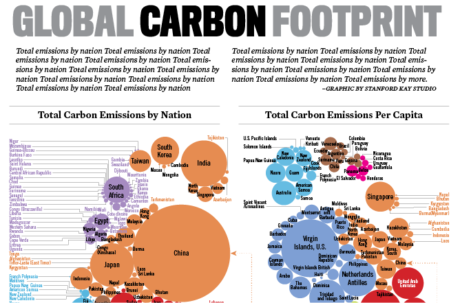
This unique visualization of global carbon emissions data has been included in multiple collections of notable infographics. It features two footprints – one showing the carbon emissions of each nation, and the other depicting per capita emissions – that clearly highlight the imbalance.
Visualizing Impact
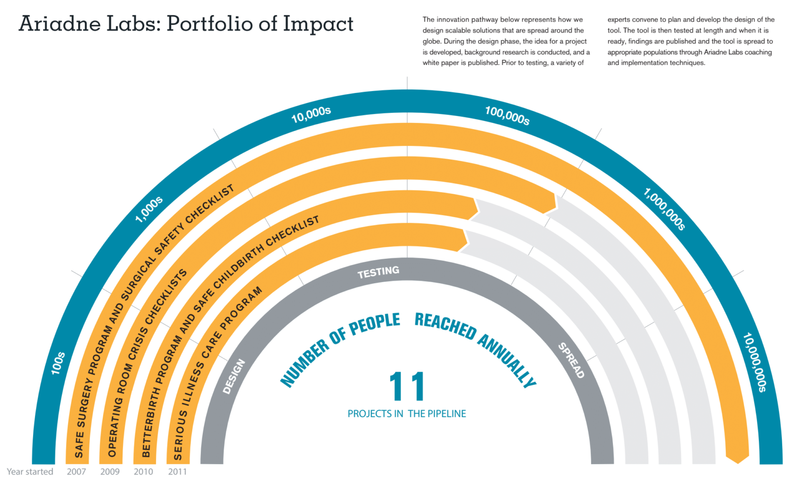
A new way to visualize the numbers of people impacted worldwide by Ariadne Labs’ various initiatives.
Doomsday Dashboard
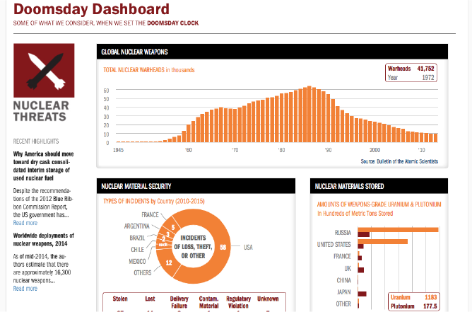
Bringing together data from multiple sources, this interactive graphic provides a singular window into the current state of major threats to life on earth — nuclear weapons, climate change, biological dangers, and more. View the Doomsday Dashboard
Diversity in the Workplace
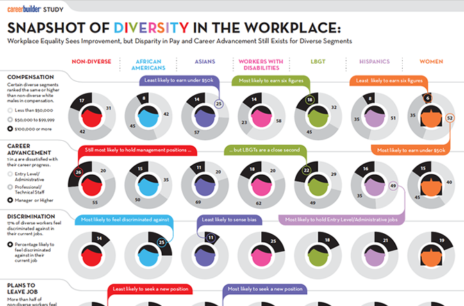
CareerBuilder.com compiled a rich data snapshot of Diversity in the Workplace. It took innovative visualization, inviting iconography and clean design to bring story to the public.
UNC Student Majors
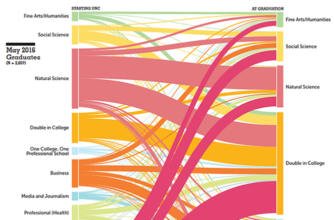
Creative this innovative look at the shifting majors of students within the university over time. View the infographic
Media on the Mind
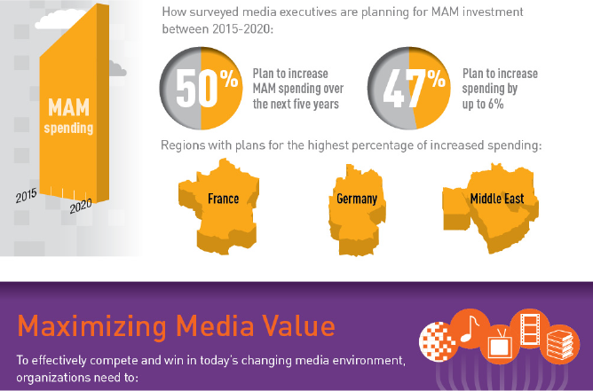
To support a major product launch, Avid commissioned a survey of big media companies sharing their perspectives on content management. We provided a compelling visual summary of the key findings, which Avid then used in their PR and digital marketing efforts.
The Nuclear Notebook
The cold war may be over, but the world is far from rid of nuclear weaponry. This interactive graphic details the growth in both the number of nuclear states over the years and the quantity of nuclear warheads each country has. Deep historical context offers an extremely rich experience. View the Nuclear Notebook
Changing Strategies in Uncertain Times
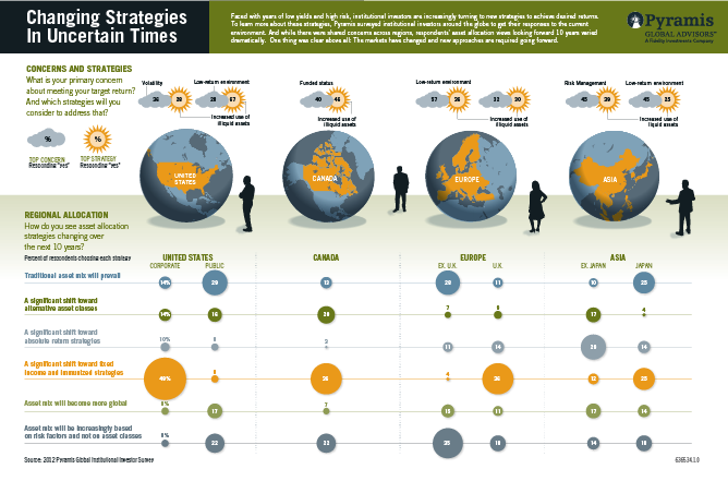
The centerpiece of a report about the attitudes and concerns of Institutional Investors around the globe, this 2-page data visualization spread breaks down views and concerns by region. An interactive version allowed viewers to dive even further into certain parts of the data. View Institutional Investor
World Disasters Report
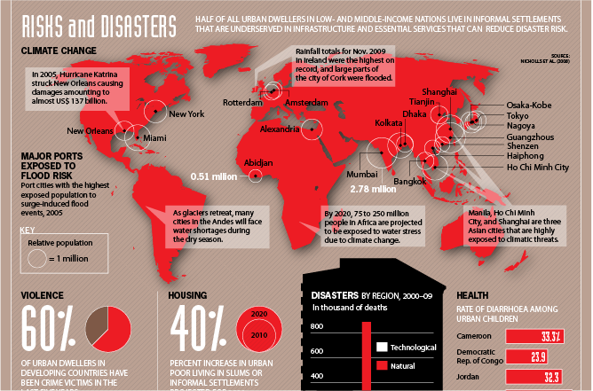
The International Red Cross issued a 200+ page report of the risks associated with the shift in the world’s population to massive urban centers. For those who couldn’t take the time to read the full publication, we created a rich infographic to create a sense of urgency around the critical messages.
