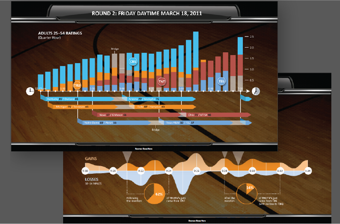
The first time the NCAA basketball tournament achieved an audience of millions across both traditional broadcast and digital media channels, TNT wanted to fully understand these dynamics. We helped them turn their raw data into visual information that helped set future strategy.
Client Project Tag Archives:
Alphasector Premium Index Performance
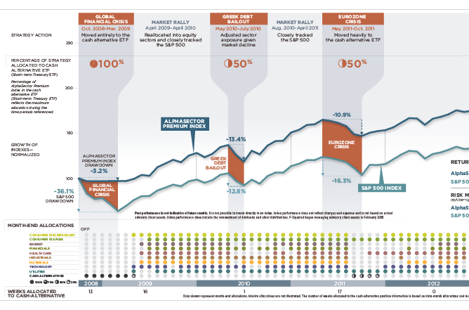
This elaborate data visualization not only shows how well F-Squared’s premium investment product performed vs. the S&P 500; it also tells the story of how the firm avoided most of the downdraft created by previous recessions and volatile markets. View the report
Securing the Big Data Lifecycle

We created this infographic for Oracle, and in partnership with MIT Technology Review. This graphic uses bold graphic elements closely aligned with the Oracle brand to clearly and visually convey the security risks and concerns associated with Big Data – and explain how Oracle’s technology can help mitigate risk. View the infographic
Literacy on the Rise
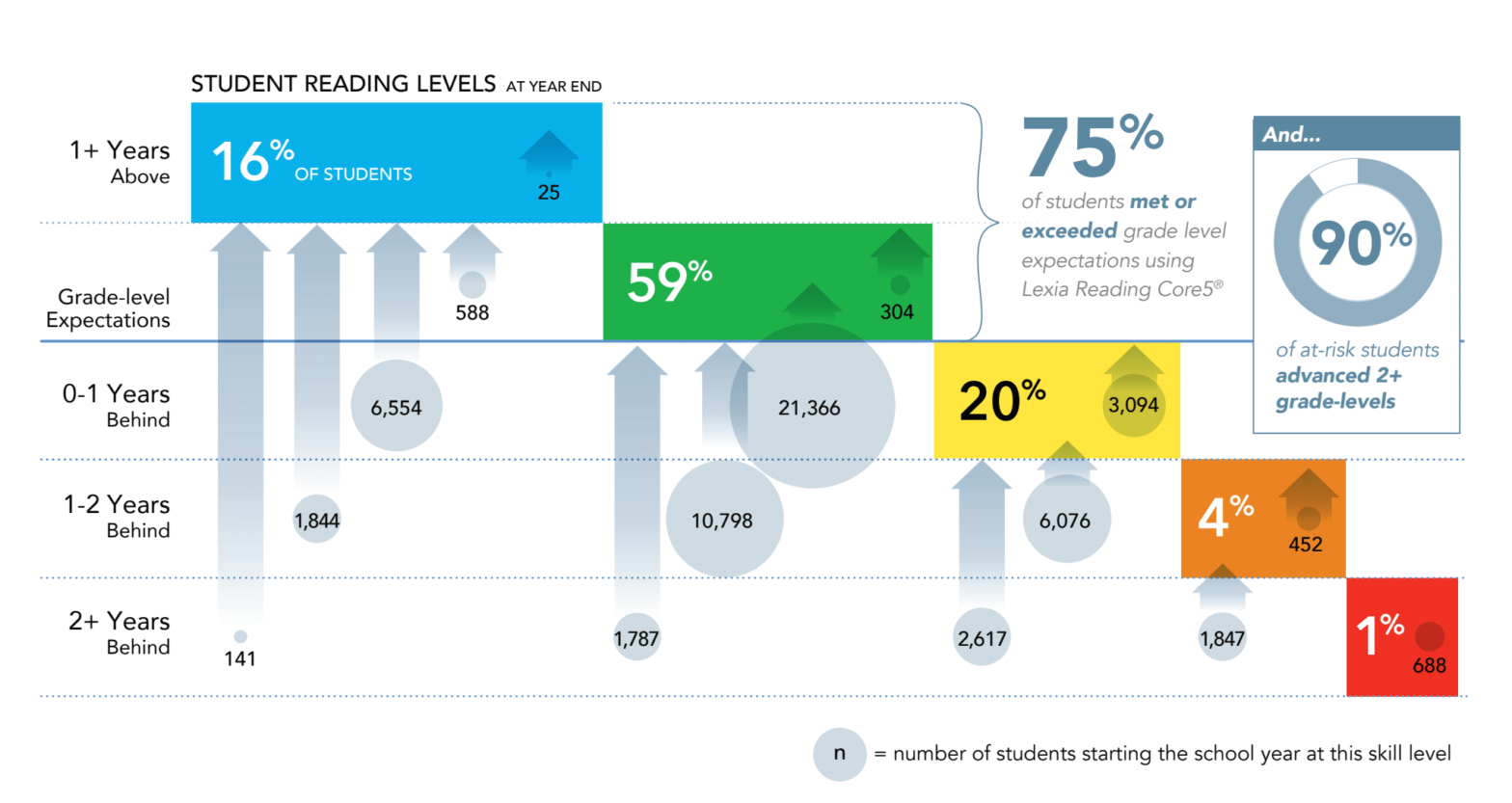
This data visualization highlights the remarkable literacy gains by students using Lexia’s reading application.
